Ready-made digital marketing dashboard examples and reporting templates

Browse our library of plug and play Marketing, PPC, SEO, Data Analytics templates and more to get up and running in no time. Simply choose a template, connect your data sources, and your data will start flowing in minutes.

Not sure where to start? Take a dashboard tour!

See dashboard examples from real companies for CEOs, CMOs, CFOs, and More

Take a dashboard tour below!

Multichannel Marketing Dashboards & Reports

Work in comfort while Adriel handles the heavy-lifting.

Connect to over 600+ data sources such as Facebook Ads, Google Analytics, TikTok Ads and more to gather and unify all your data within beautiful dashboards and templates. No more spreadsheets, no more manual data analysis.
Get started with one of our free templates today!
Tag
Marketing Agency Report Dashboard Template
Ditch Excel spreadsheets. Track and analyze your clients marketing data from all channels on one dashboard.
Connectors used:
Ad Creatives Dashboard Template
Get a bird’s eye view of how your ad creatives are doing on all your PPC ad channels. A/B test creatives and messaging on one reporting dashboard.
Connectors used:
LinkedIn Organic Dashboard Template
Easily track your brand's or client's organic LinkedIn performance on one dashboard. Focus on the metrics that matter most to you using our fully customizable, ready-made LinkedIn reporting dashboard.
Connectors used:
Client Report Dashboard Template
Tired of spending countless hours on reporting? Break free from spreadsheets and create client reports in minutes.
Connectors used:
Customer Segmentation Dashboard Template
Understand your ad performance across different segments – gender, age, and devices. Adjust your advertising strategy based on these insights and boost ROI.
Connectors used:
Ad Creative and Material Dashboard Template
Get valuable insights about your ad creatives that you can’t get anywhere else. Analyze which ad materials, videos or images, work better for ROI.
Connectors used:
Digital Performance Dashboard Template
Reporting digital marketing performance to C-Suite? No problem. Visualize a snapshot of marketing performance and key metrics on one dashboard. Download stunning white-labeled reports or share live links in one click.
Connectors used:
GA4 and Ad Performance Dashboard Template
Aggregate and visualize your ad data and GA4 data on one dashboard. Get unique insights into the customer journey of your target audience, and make data-driven decisions.
Connectors used:
Cross-Platform Dashboard Template
Automate the entire process of aggregating your ad data from multiple platforms with a cross-platform dashboard.
Connectors used:
Oops! No matching results were found with your current filters.
Looking for more? Get in touch with our team

Need a custom reporting or dashboard template?
We got you covered.

Get your custom template within 48 hours

Have a report you’d like us to replicate, or need some extra assistance? Get in touch with us and we’ll build a template within 48 hours to help you evaluate Adriel for your business’ specific goals.
Get a Demo

If your reporting looks like this on Excel

Let us help! Adriel automates the entire process for you. No more time spent extracting and standardizing thousands of metrics and dimensions from different platforms for reporting.

What is the purpose of a dashboard?

Complex customer journeys and the demise of IDFAs have paved the way for multichannel marketing. Gone are the days when marketers invested in only one or two channels and saw substantial returns on investment. Brands must target customers across multiple touchpoints, or risk losing out on brand awareness, engagement, and sales.

But more channels mean more data and more collaborators. As multichannel marketing becomes the norm, organizations are plagued with tedious, time-consuming tasks and manual workflows. Two-thirds of marketers now see problems with their level of data integration, timeliness, and accessibility.

That’s where dashboard software comes in.
Marketing dashboards are data visualization tools that aggregate and analyze all your advertising data in one place. They collect data from multiple sources, unify and map it automatically, and populate key KPIs on an easy-to-digest user-interface.

If you have multiple marketing campaigns running across different platforms like Meta and Google, a reporting tool can pull all the data from each campaign through data connectors, and turn this data into actionable insights. This means you don’t need to have any technical or coding experience to get your data.
A good digital marketing platform acts as a comprehensive command center. It shows you all your media, messaging, and performance so you can make real-time decisions based on how the audience is responding to your creatives and whether your ad campaigns are performing as expected.
Adriel’s marketing dashboard was built to be a single source of truth for all your marketing data. Automate monotonous tasks, eliminate manual data stitching, and focus on finetuning your marketing strategy.

What should a dashboard include?

A superstar marketing dashboard will…
Connect with data sources in minutes- no code required
Present key performance indicators and other important metrics across channels all within a centralized workspace
Show granular data, right down to the ad creative level
Stream and update data in real-time
Allow users to set custom alarms to monitor poor-performing campaigns
Generate whitelabeled reports filled with jaw-dropping visuals and data displays
Here are some of the key marketing KPIs that you can track on a data dashboard:
But more often than not, performance dashboards focus too much on vanity metrics - the green numbers that look on screen but don’t really relate to business growth. When it comes to effective reporting, numbers are just the tip of the iceberg. An overload of vanity metrics can not only overwhelm executives but also negatively impact decision-making.

Instead, follow these three steps for impactful dashboard designs:

1. Establish a KPI framework.

From the very get-go, pick three to five KPIs to display on your dashboard that are simple to explain and understand. Drag and drop widgets onto your dashboard interface to display these chosen performance metrics.

Most KPI dashboards let you drag-and-drop widgets to display KPIs in various ways. For instance, on Adriel, you can create widgets for single KPIs or compare them against one period to another to visualize trends.

2. Write executive summaries.

Add a few sentences at the top of your dashboard describing the KPIs with the metric name, numbers, and percent changes in brackets. Click here for examples.

3. Organize your data intuitively.

Structure your dashboard the way you write stories–with a clear beginning, middle, and end. Check out this article on how you can achieve this.

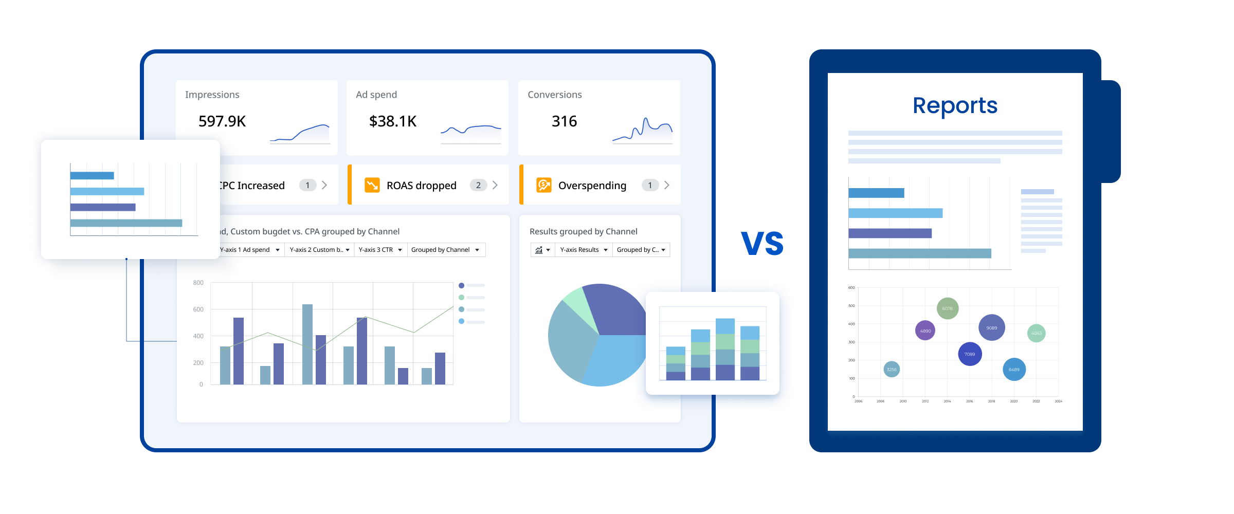
What is the difference between a dashboard and a report?

While dashboards are similar to ad reports, they’re not exactly the same. Here are the main differences between the two:

1. Dashboards are interactive, reports are static.

On an interactive dashboard, you can see performance changes in real-time, experiment with widgets and graph types, and adjust the metrics and trends you want to visualize. Once you’re satisfied with your dashboard, you can then download the data as a PDF or CSV report, but they will no longer be customizable.

2. Dashboards are comprehensive, reports are focused.

Dashboards provide a wide range of information to showcase an overview of your marketing performance. In contrast, reports zoom in on a specific narrative depending on who it’s for. For instance, a report for a CFO would focus on sales performance, while one for a CMO would focus on an in-depth analysis of channels and creatives.

3. Dashboards are for internal teams, reports are for executives and clients.

Because dashboards are interactive and comprehensive, they’re usually for internal teams to keep track of insights and make day-to-day decisions. When the time comes for monthly or quarterly reports, teams put together reports based on the dashboard data for executives and other external stakeholders (e.g. clients).
On Adriel’s dashboard, you can get the best of both worlds. Create different views for different stakeholders on an interactive dashboard and generate white-labeled reports in just a few clicks.

What our customers say

Get a Demo
“Adriel has tured our 2-hour long weekly reporting meetings into 5-minute coffee break conversations.”
Andrea Vahl, Founder & CEO, Vahl Ads
“This is impressive. It takes months with Datorama to get what Adriel does in 5 minutes”
Leslie Lee, Director of Analytics, Incus Services
“Adriel is the number one salesman for my agency.
The level of service and transparency it brings for my clients is simply unmatched.”
Paul Townley-Jones, Founder, Paparico

FAQs

All your questions answered. And if you can’t find it here, chat to our friendly team.
Why do I need a marketing dashboard?
We understand that marketing dashboards are a big investment. But they can definitely level-up your marketing arsenal for three main reasons:

1. Contextualization: In the digital marketing landscape, there’s simply too much data for even the brightest analytics whiz to be able to connect the dots between disparate data points in their raw state.

But with a business intelligence dashboard, you’ll be able to see this data in context in digestible widgets and graphs.

2. Automation: Dashboards eliminate manual workflows that would otherwise eat up a great deal of time and prevent your team of marketers and analysts from working on needle-moving tasks.

3. Faster reporting: Self-service BI dashboard software like Adriel offers a white-labeled reporting feature that allows both business users and end-users to put together reports packed with real-time insights and intuitive data displays.
How do I choose the right marketing dashboard?
We get it–there are lots of marketing dashboard software in the market, ranging from enterprise-level software like Salesforce, to small-to-medium business focused tools like Adriel.

How do you choose the right fit for your organization?

Here are three things to consider:

1. Comprehensive, easy integrations
Most dashboard software in the market allows you to connect with anywhere from 60 to 600+ advertising and analytics platforms. The more connections, the better.

But it’s not just about the number of connections but also how easy it is to connect to these data sources. On Adriel, you can connect to 650+ data sources, ranging from ad accounts, eCommerce social platforms, and analytics tools–all in a matter of a few minutes.

2. Supports real-time data and custom alerts
Look for marketing software that not only streams real-time data but also automatically tracks all the data and alerts you whenever campaign metrics go above or below a certain KPI.

This would greatly reduce the time your account managers and marketing executives would have to spend going into each ad platform to make sure everything is on the right track, which can propel faster decision-making.

3. Visualizes granular data
Choose software that not only visualizes KPIs but also shows you granular data down to the ad level and allows you to report back on headlines, CTAs, and ad copies that created value for your clients.

This kind of dashboard will let you A/B test natively on one platform and use this data to create more personalized and relevant ads.
How do I use the dashboard examples?
You can use these dashboard templates as references to create clear, compelling, and high-impact reports for any member of your organization–from CEOs to CRM and sales teams.

All you need to do is find a marketing analytics dashboard tool that would aggregate all your ad data from various sources and let you customize the dashboard to display metrics.
-> Book a demo & try Adriel 14 days free
How do I monitor my PPC campaigns?
To monitor PPC campaigns, you need a marketing automation tool. On Adriel, you can start monitoring the PPC campaigns you created and optimize according to the results–in less than 5 minutes.

All you need to do is follow these 3 steps:

1. Create an account
No credit card is needed, and you can try it for free for 14 days!

2. Connect your tools
Connect data sources to your workspace to import dimensions and metrics.

3. Use our pre-made PPC dashboard
You do have an option here. You can start from a blank page or utilize our PPC dashboard template.
What kind of charts and graphs should I use to visualize my PPC data?
We’ve rounded up ten data visualization examples you can implement on your business dashboard:

 • Bar charts
 • Funnel charts
 • Scatter plot graphs
 • Notepad widgets
 • Single metric widgets
 • Creative widgets
 • Draggable widgets
 • Resizable widgets
 • Color clustering
 • Word clouds

For a detailed breakdown of each visualization type, click here.

Take control of your marketing data today

Thank you! Your submission has been received!
Oops! Something went wrong while submitting the form.
Don't Go!
Book a 1:1 Demo Instead.
We’ll help you optimize your Ad Operations processes and save thousands of dollars every month on ad spend and reporting.
Thank you!
You will be redirected shortly.
Oops! Something went wrong while submitting the form.